
If you’ve ever sat through a nonprofit board meeting where eyes glaze over at the sight of a dense, ten-page report, you’re not alone. I’ve been in those chairs and I’ve learned that how you present information can matter just as much as the information itself.
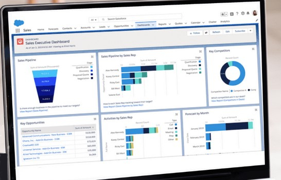
Enter the dashboard-style board report. Clean. Concise. Visual. Designed to keep your Board informed and engaged.
Why Format Matters
Your Board members are busy people. Many are volunteers juggling this role with careers, family, and other commitments. The monthly board report shouldn’t feel like a homework assignment—it should be a helpful briefing. When it’s easy to read and digest, your Board is far more likely to engage in meaningful discussion and decision-making.
Think of the dashboard report like a car dashboard: it doesn’t tell you everything under the hood, but it shows you what’s most important at a glance—are we on track, is there a red flag, and where are we headed?
What to Include in a Basic Monthly Board Dashboard
Your dashboard doesn’t have to be fancy. It can be a well-structured one-page document (or two at most), created in Word, Excel, Canva, or even directly in the body of an email. The point is clarity.
Here’s a simple structure that works well for most small to mid-sized nonprofits:
1. Key Metrics (with visuals if possible)
Use 3–5 critical indicators that align with your mission and current goals. Bar graphs, pie charts, and progress bars work well here. Use consistent colours and labels each month. These might include:
- Program participation – e.g., “# of youth served this month”
- Fundraising progress – e.g., “YTD donations vs. annual goal”
- Volunteer hours – e.g., “Total hours logged this month”
- Budget tracking – e.g., “Actual vs. budgeted expenses (high-level)”
2. Highlights & Wins
A brief bullet-point section sharing notable successes or good news. This is your chance to celebrate progress and keep morale high:
- Secured $10,000 from local community grant
- Welcomed 3 new volunteers this month
- Received positive media coverage in the local paper
3. Challenges or Risks
Keep it short and constructive. Just flag what’s emerging on the horizon. Board members appreciate transparency. You’re not burdening them—you’re giving them a heads-up.
- Program attendance is lower than expected—reviewing outreach strategy
- Staff sick leave is higher than usual—impacting service delivery
4. Decisions Needed This Month
Make this a separate, clearly labelled box. This helps your Board focus and prepares them to contribute meaningfully to discussions. Use empty check boxes for greater impact.
- Approve updated HR policy
- Confirm speaker for upcoming fundraiser
5. Key Dates & Reminders
Don’t assume they’ll remember. A calendar snapshot or sidebar works well here.
A Few Final Tips
Keep language plain and conversational. No jargon, no walls of text. Repeat the format each month. Familiarity makes reports easier to scan. Deliver it a few days before the meeting. This gives your Board time to read and reflect.
When used consistently, a dashboard-style report does more than inform—it invites your Board to stay connected, ask better questions, and make stronger decisions. It helps them feel like partners in the work, not just passive recipients of information.
Need help making your report dashboard look pretty and engaging? I’d love to help.